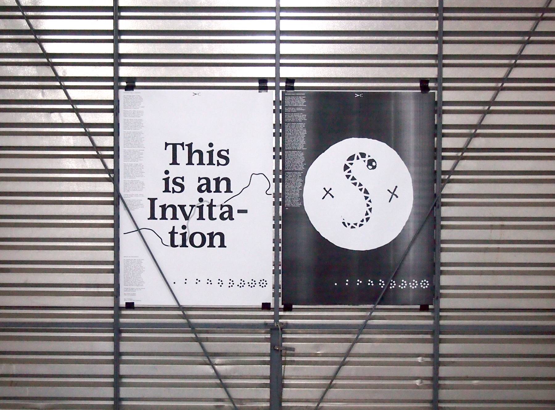
This is an Invitation.
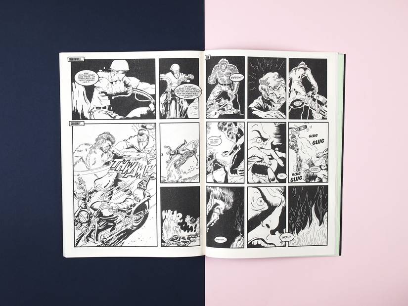
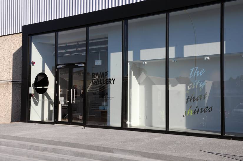
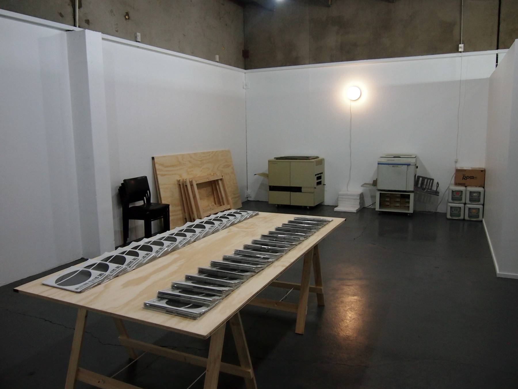
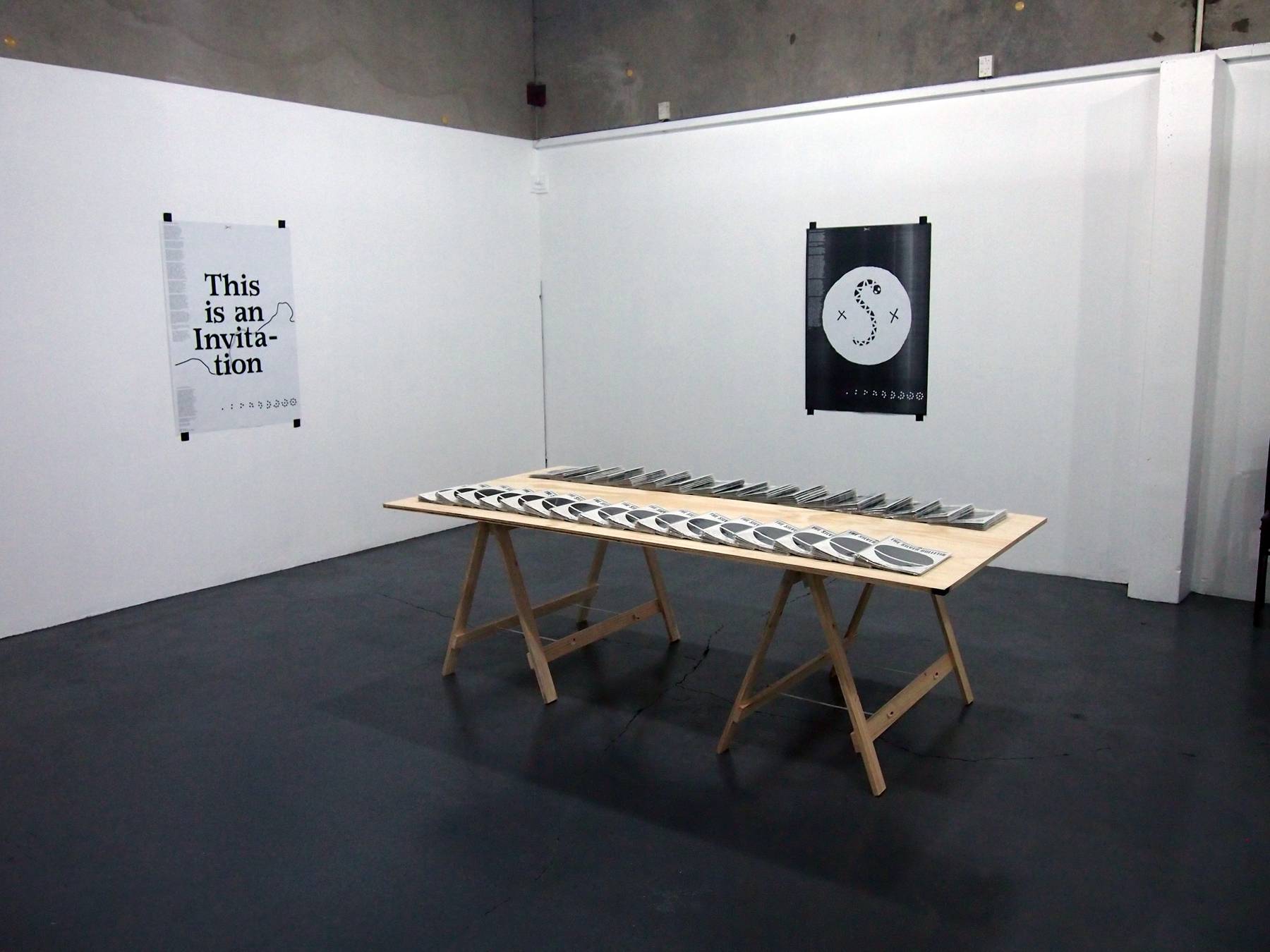
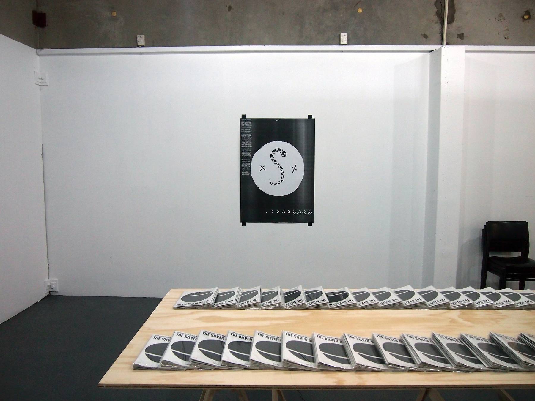
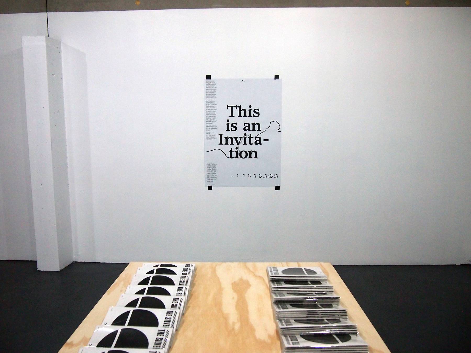
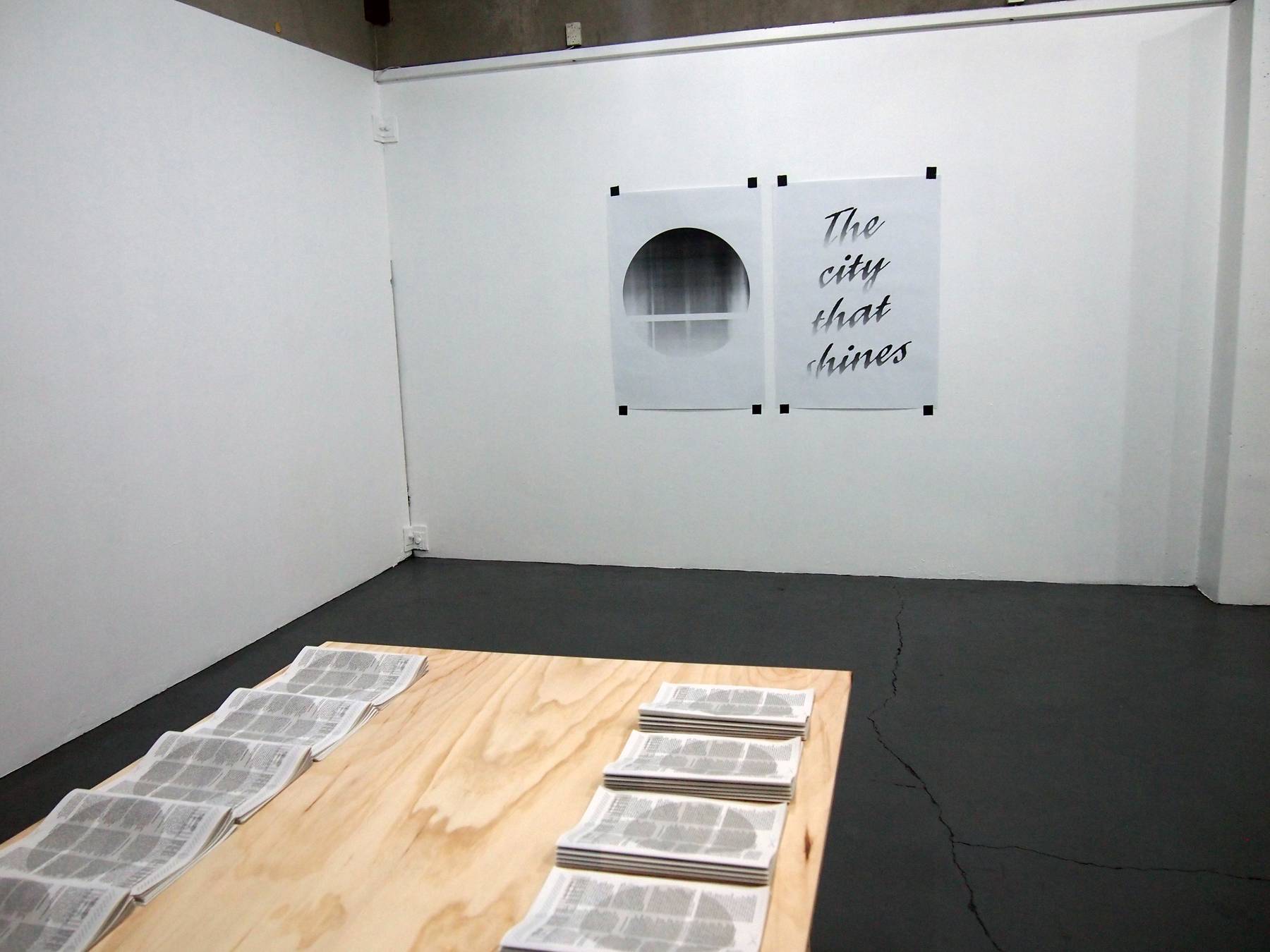
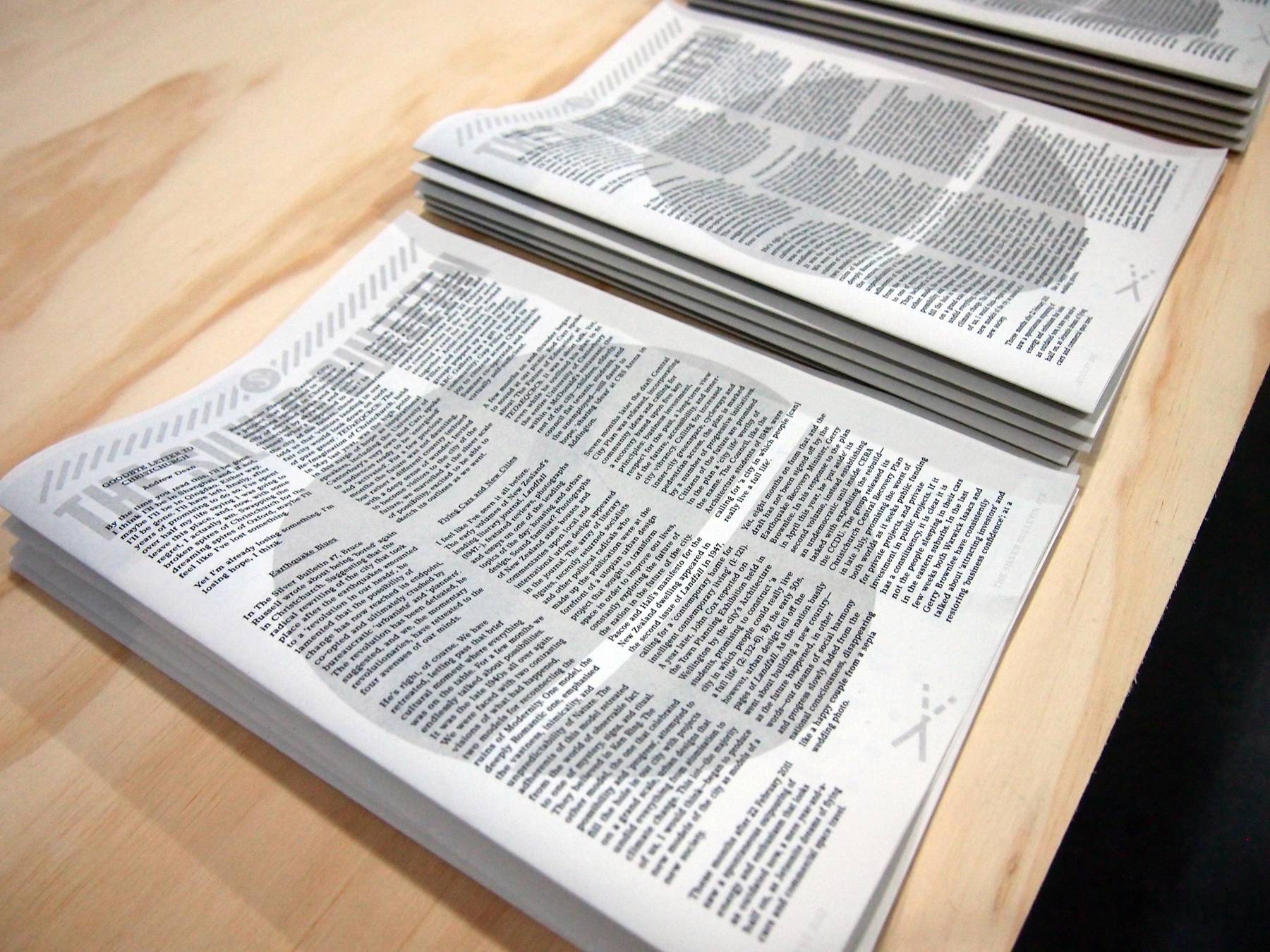
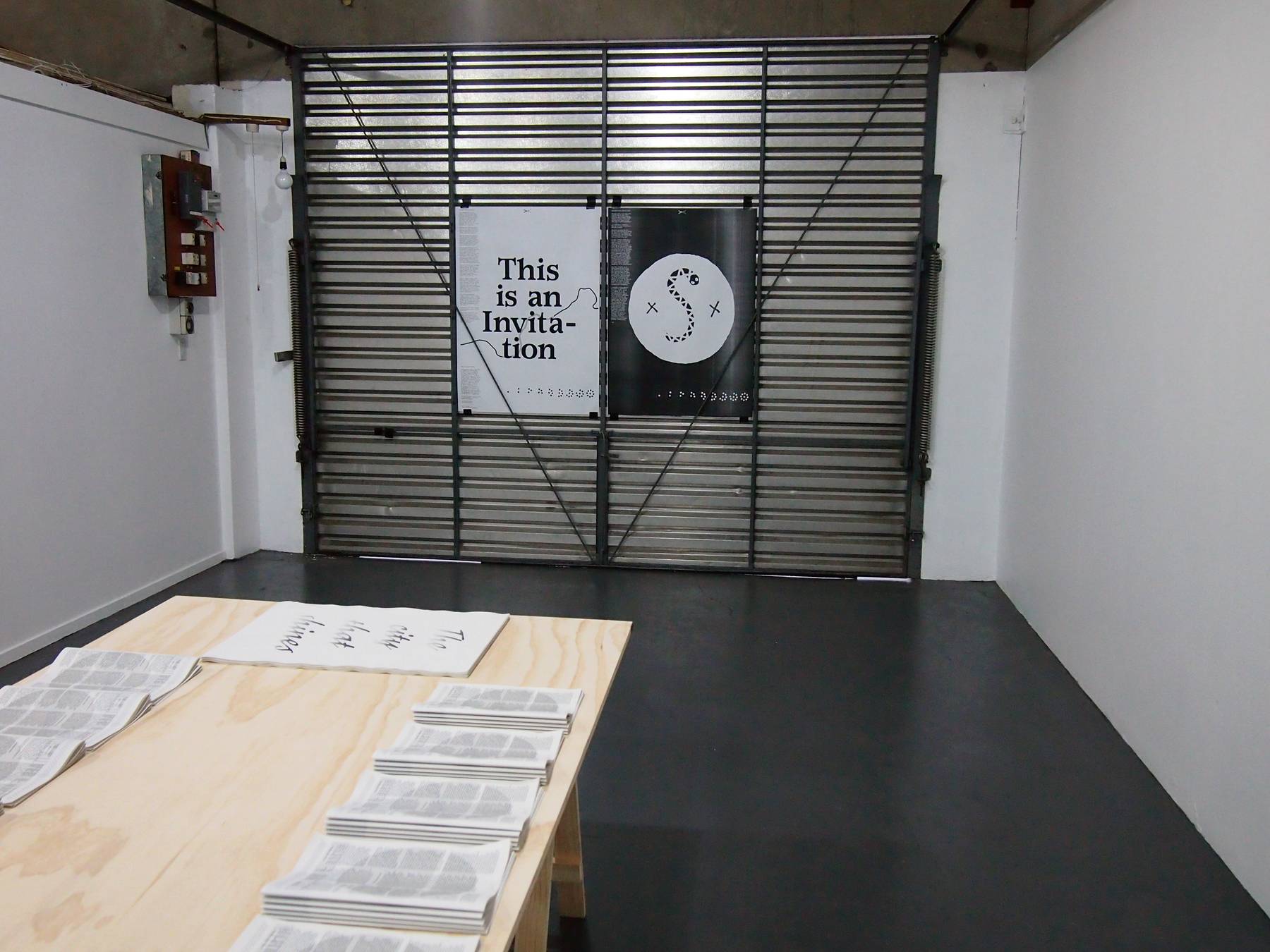
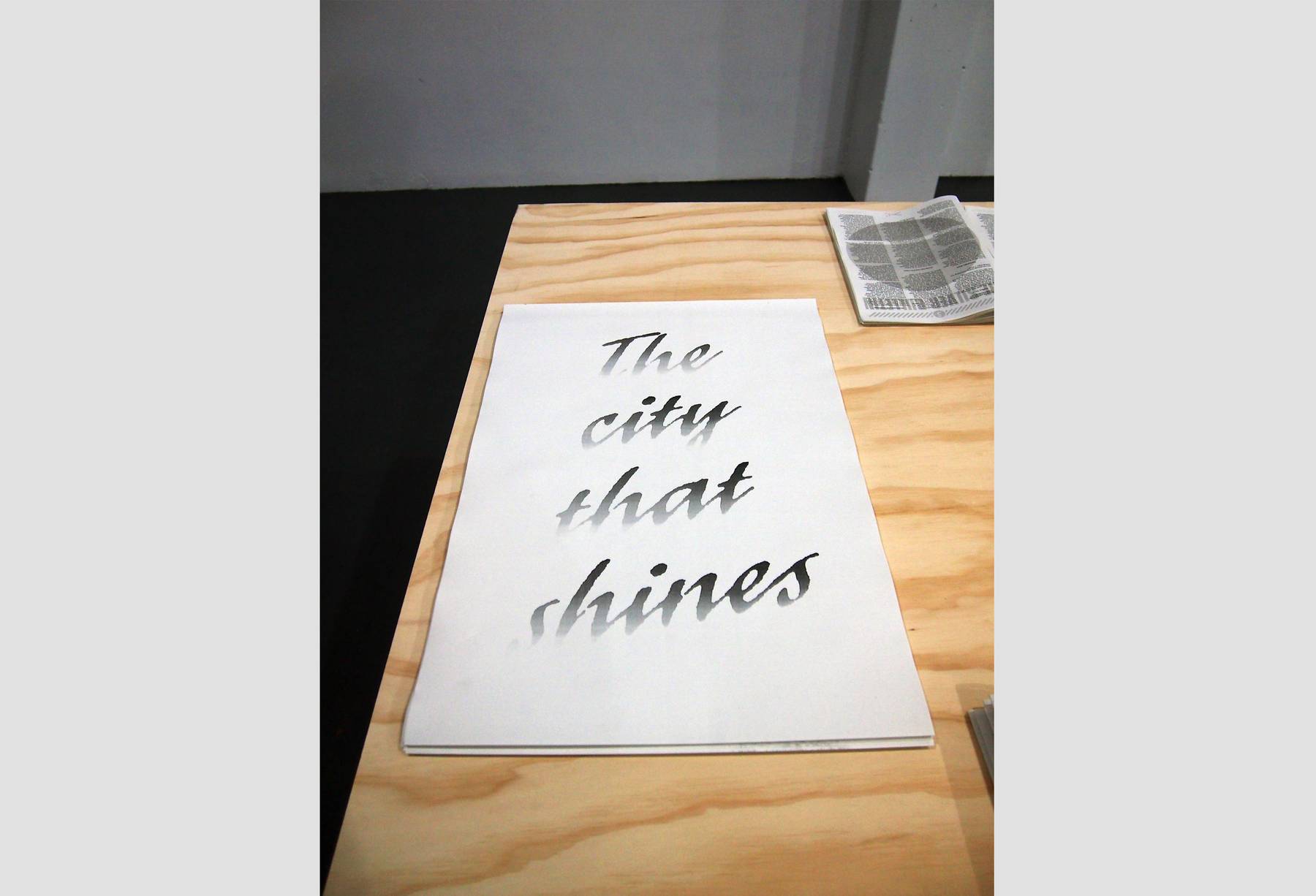
This is an Invitation was a Silver Bulletin project at Dog Park Art Project Space in Waltham, Christchurch. It began with the release of The Silver Bulletin #7 on opening night, and was followed by a three week residency in the space. I set the space up with a Risograph and A2 photocopier, with the aim to produce an entirely new publication by the end of the residency.
This new publication—The Silver Bulletin 7.5—was made up of content generated in direct response to either the content in issue 7, or to the circumstance under which the publication is being produced. The public were invited to visit Dog Park during opening hours, witness the publication take form in the space over the 3 week period, and maybe even become contributors themselves in the process.
By shifting the location and circumstances of production, this is project is an investigation into importance of surroundings as a factor in production; and that location must always have some bearing on the producer, production and the viewer’s experience of the product. I produced two companion texts for the show which are appeared on a double sided poster, and are reproduced below.
Distributal Content
The opening scene of John Berger’s 1972 BBC series Ways of Seeing finds the host cutting the head of Venus out of Venus and Mars - an early Renaissance painting by Sandro Botticelli. The screen then fades to the same, cropped detail of the painting, only this time, as a paper reproduction—a postcard. Working off of Walter Benjamin’s text Art in the Age of Mechanical Reproduction (1936), Berger then states: ‘with the invention of the camera everything changed.’ With the advent of the camera—and other means of mechanical reproduction—a painting that could only have been viewed by traveling to a specific gallery or museum could suddenly be mass-produced and found on living room walls the world over. This not only impacted on the accessibility of artworks, but also on how art was experienced: ink on paper as opposed to untouchable paint... next to a vase of flowers, a plastic wall clock and images of the nightly news as opposed to surrounded by same era paintings or white walls... a black and white thumbnail in an art history volume as opposed to full colour, full sized, in front of you.
New contexts infer new meanings and so, when a painting is experienced through a postcard, it is experienced as a secondary source—seen in a new and different way—a way completely unintended by its maker. A renaissance painting was never meant to travel like this. This all changes though, when thinking about a publication—an object that IS intended to travel—where the paper, the ink and the format are primary. While ink and paper might misrepresent a painting, in the case of a designed publication these elements are the medium... they are necessary and considered, an integral part of what is represented. This is the self-referential nature of graphic design and the designed, printed object. A design publication can have articles about design in it but as an object say just as much, perhaps more, about design than any group of words that might be printed between the covers. Content is in the words, content is in the design, content is in the production. And though content can’t help but be localised—tied to its maker, and its maker to his/her surroundings—a publication intends to be distributable. It is a primary document, sent out from one place and viewed in multiple locations.
Distributal Production
Recently, while in the final stages of producing the latest Silver Bulletin, I was feeding compiled groups of pages through a folding machine, pressing a button and watching them appear out the other end as finished publications. As I stood there, I started to think of each one representing a potential recipient. Moreover, the particular DIY process I had employed in making the publication felt significant. As if there is an extra value placed into something when it’s made by those who care about it the most. It’s easy to dismiss production as neutral—a means to an end that holds no content of its own. But when you think about it; how something is made, by whom it is made, and the materials it is made out of... in these choices lie the etymology of an object. Techniques of manufacture can’t be neutral... surely even at their most neutral. Even a paperback novel is still produced at a specific time and in a specific place, and so can’t help but hold at least a slight bit of cultural meaning and aesthetic character. How much more so when the means of production are owned, defined and given significance by the object’s author?
All of this reminded me of Walter Benjamin, and his text The Author as Producer (1934) that championed the Marxist ideal that ownership of “means of production” is at the heart of human culture. Benjamin called for authors to understand and control the technologies that publicise their work. The idea was to lessen the distance between author and reader, even going so far as to turning “readers and spectators into collaborators”. I continued to think this over as I folded my publication. I had spent forever staring at a singular file on my computer, and now here it was, manifested in physical form as multiple publications soon to be dispersed and, in doing so, each becoming singular again. In picturing this impending exchange between publisher and audience, the ever-growing number of publications on the other side of the folding machine began to represent something bigger than themselves. The publication was a telegraph, an exercise in exchange, a facilitated discussion, a map of contributors, an archive of thoughts, and an invitation for future collaborations.
