Festival of Transitional Architecture.
The annual Festival of Transitional Architecture is a free, public event that engages with the city of Christchurch (New Zealand) by exploring urban regeneration through large scale collaborative projects and urban interventions.
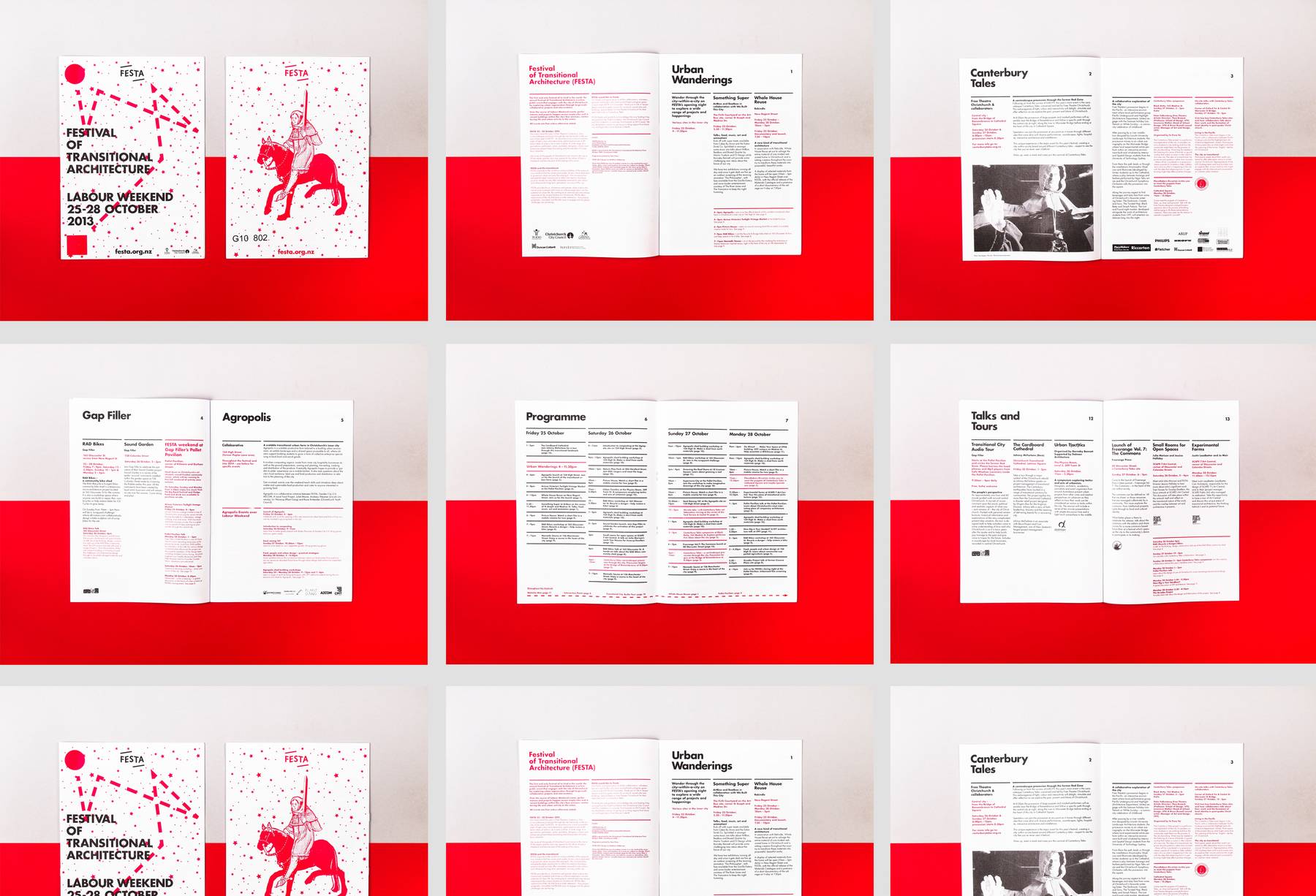
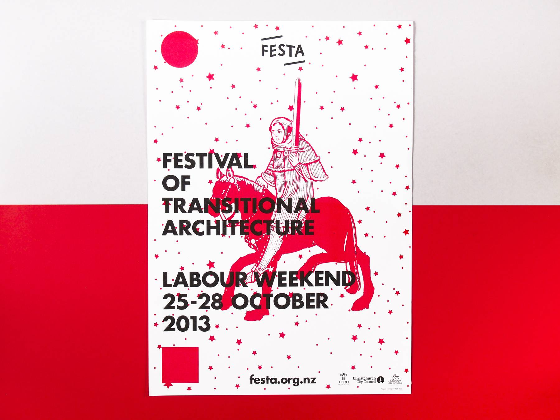
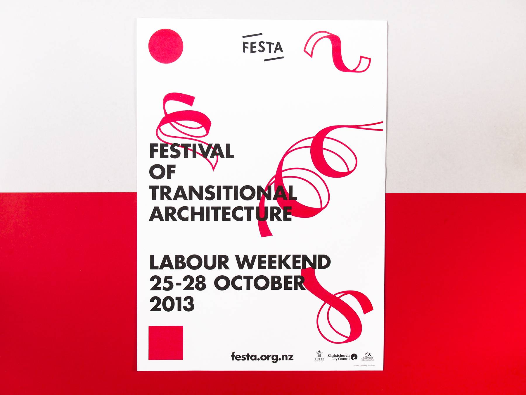
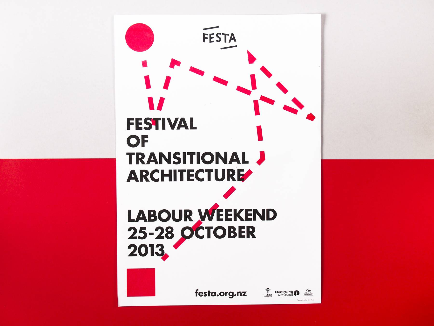
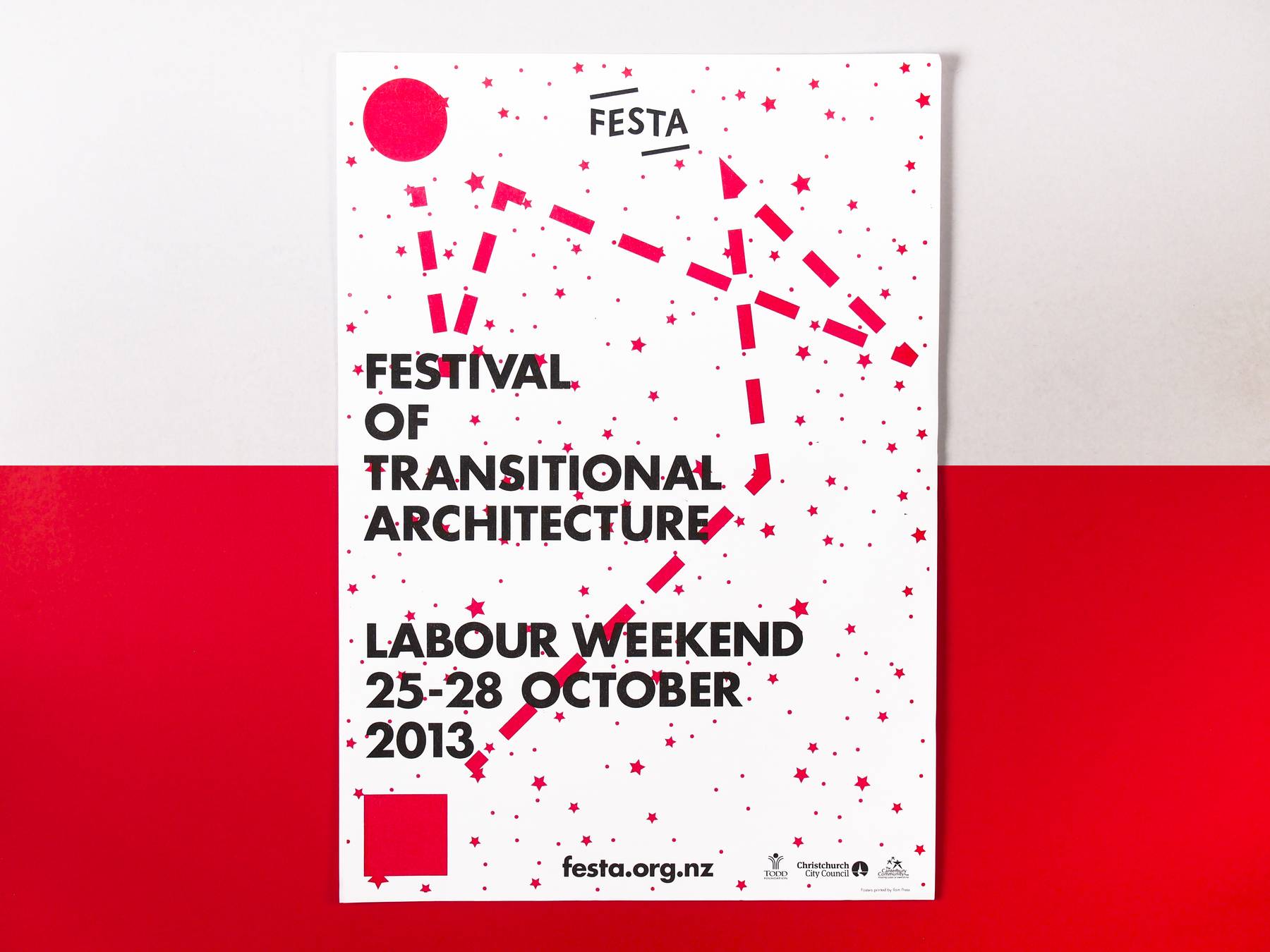
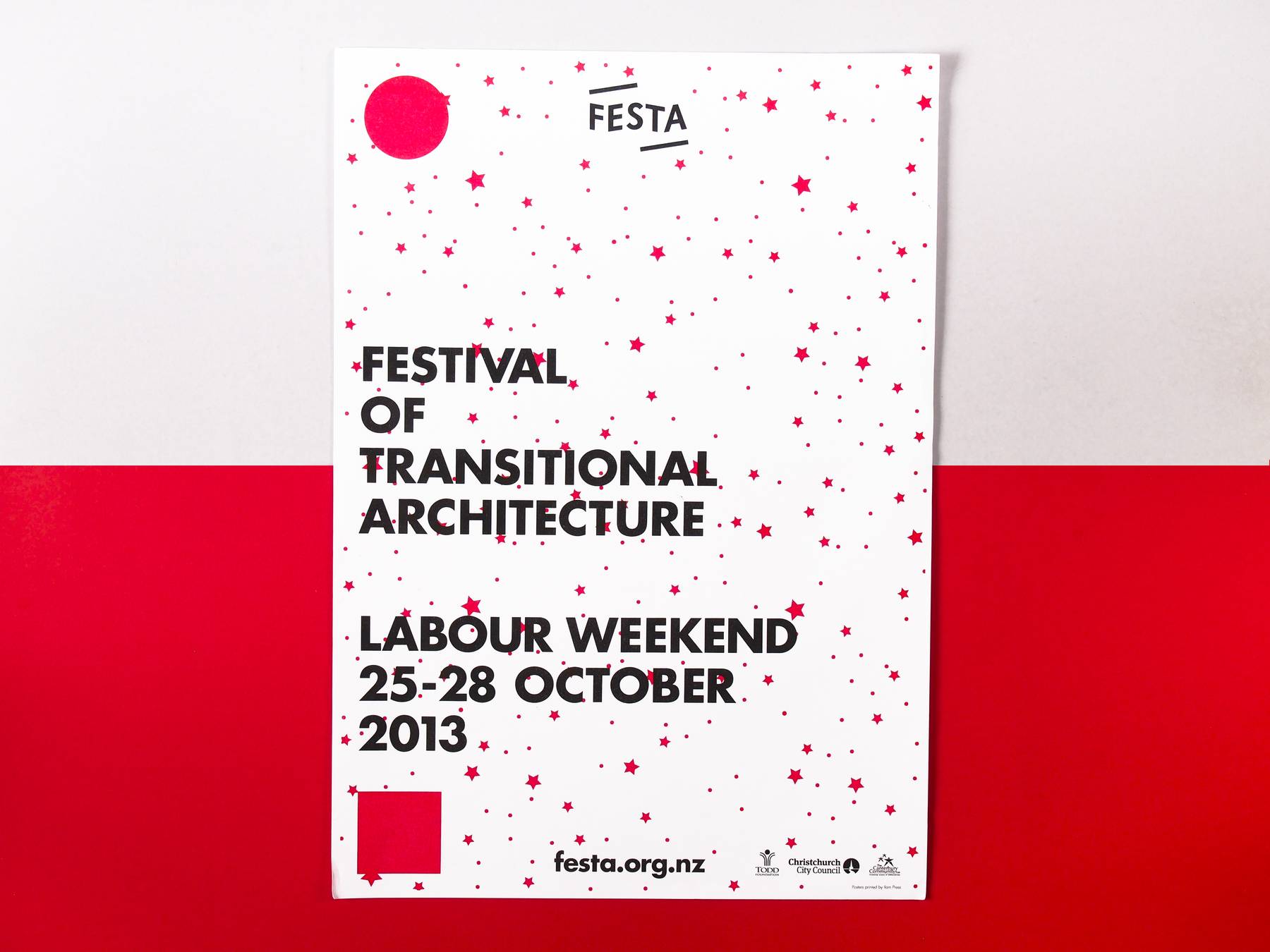
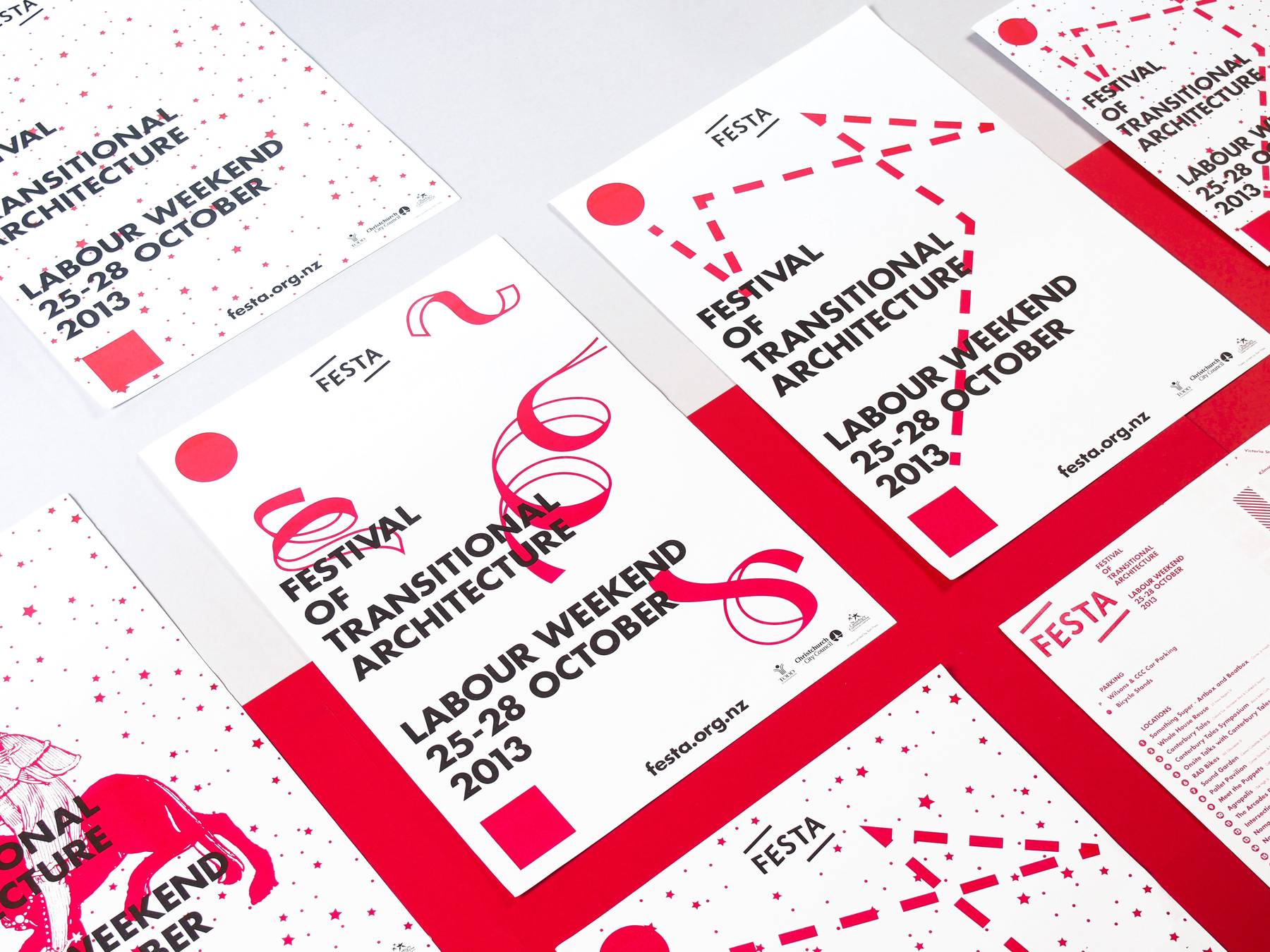
I was asked to design the visual language for 2013. The concept was to use Risograph printing to create a simple two colour, interchangeable set of posters. These were then tiled to make larger compositions. I was interested in exploring the idea of the transitional through creating a 2 fixed points on the posters, using a circle and square in the top and bottom left hand corners of the poster to act as a point A and B.
The idea from there was that whatever was happening between those two points was in a transitional space. I also had a reoccuring star pattern that I created from a clip-art file, the point of which was to illustrate that the Festival had both day and night programs. Beyond these elements, I relied heavily on the use of Risograph red and black, and the typographic layout, to create the sense of a consistent visual language despite the irregular use of imagery.