Way-Finding
This article first appeared in The Silver Bulletin #5.
I’ve been thinking about way-finding systems — signs and systems for getting from one place to another. Both architectural and typographical devices that dictate how we navigate our way through a place and, more speculatively, the references that exist in a designed object; how they act as anchor points along a line of enquiry. These references make up a road map of sorts—a set of influences that lead to a final destination. We make things by looking at other things, we form ideas by being informed by other peoples ideas; we find our own answers by gathering evidence left lying around by others.
The term ‘Way-finding’ was first used by the architect Kevin Lynch in his book The Image of the City (1960).1 In the book, Lynch presents what he terms ‘The Image’ — a primary in-built way-finding device based on memory and individual perception. Stronger than any outside devices such as street numbers or road signs, ‘The Image’ is our cognitive map; what we remember of a place, or an event.2 The theory supposes that each persons ‘map’ can be vastly different, we all naturally choose references that align with previous experience, we apply our histories to the present.
Relating this to my metaphoric, speculative kind of way-finding, ‘The Image’ is just as relevant. We store up the things that influence us, ready to be called upon when we need to get from one place to another.
In many ways this seems like an obvious observation, which I suppose it is, but with the following examples I want to relate it specifically to graphic design. In pointing this out I hope to illustrate that, in ways different or more acute than other disciplines, graphic design lives off of outside influences, it operates in the margins of other disciplines, it bastardises the standards. I have been gathering examples that serve to exemplify this idea, a sort of round-a-bout exercise that continues to prove itself – through itself. The following examples consist of both personal experiences and historical accounts, examples where this notion is over emphasised or particularly notable — evidence of evidence, if you like.

1. Bob Dylan & Modern Minstrelsy
When Bob Dylan released the album Love And Theft in 2001, people almost immediately began to pick up on the fact that the songs within were not entirely ‘new’. The lyrics and base melody structures call on a vast array of (mostly) American folk music history. It was clear that Dylan had gone trawling through wide and disparate voices and influences, and gathered them all in one place, where he proceeded to nail them together into one concise work.
Even before the case is opened, or a note is heard, both the album title and artwork immediately make reference to this trawling, as illustrated in American Historian Sean Wilentz’s book Bob Dylan in America:
‘People noticed as soon as “Love & Theft” was released that it’s title is the same as a book by the cultural historian Eric Lott about the origins and character of American blackface minstrelsy(...) Dylan has neither confirmed nor denied that he took his title from Lott’s book, although when he placed the words inside quotation marks, he strongly suggested that he did.’3
On the album, Dylan borrows heavily from the lyrics of pop and blues songs of the 1920’s through 50’s, in some cases even making reference within his song to the songs he’s referencing.
Such is the case on the second track Mississippi where the tagline of the song; “Only one thing I did wrong / stayed in Mississippi a day too long”, comes from an old work time song called Rosie.4 Dylan fleshes out the song around the oft repeated tagline with his own prose, and in doing so he plants a lyric that makes stark reference not just to the origins of the piece, but to the very process of songwriting that he has engaged in to produce his version. 'I was thinking about the things that Rosie said / I dreamed that I was sleeping in Rosie’s bed'. In making this reference its not simply Dylan footnoting his sources, but it seems as if he’s acknowledging that his song is an act of bastardisation – or at least that in Mississippi, a bastard is what he and Rosie managed to produce.

2. Stumbling upon the Worlds End
A couple of months ago during a trip to England I caught the last train back from Brighton to London and arrived at Victoria Station to discover the subway shut. I was forced to walk back home to where I was staying in Earls Court, only stopping to ask for directions when a stranger crossed my path. Subsequently I took two hours to walk a vague line home, the streets of such a busy city completely empty. A policeman outside the station had pointed me in the general direction I should be walking, and informed me that “eventually you’ll start seeing signs for Earls Court”. As I walked I came across the new location for the Saatchi Gallery — having visited its previous site the day before to find it gone. I walked further down the road and discovered Worlds End, a bizarre thing to walk into late at night in a strange city. Signs everywhere saying ‘Worlds End Pub’, ‘Worlds End Pharmacy’. At the time, I was meant to be writing an article for the special ‘End of the World’ edition of The Silver Bulletin and so the place sparked my interest... I decided to re-visit the Worlds End the next day. Daylight revealed a huge brutalist housing estate complex that now represented the district.
I thought it bizarre that had things been slightly different: had I stayed the night in Brighton, or missed the train, or had the sense to catch a taxi, or managed to walk a more direct route home, I would have missed Worlds End entirely, and never known it existed. I found it because I lost my way; wandered a weaving, uninformed path home and found the inspiration for my article.

In the book WAYFINDING: People, Signs and Architecture, authors Arthur & Passini address this exact kind of line — a random path labelled The Shoestring Pattern. As if created by dropping a piece of string on the ground, such paths have no logic behind them, other than a point of departure and a point of arrival:
The shoestring pattern, which is based on a random or quasi-random distribution, does not have an underlying organisational principle. Users would be ill advised to search for something that is not there.5
Referring to Lynch’s ‘Imaging’ theory, the book goes onto to suggest an answer to the shoestring pattern, the very lack of order in such a pathway lends itself to be defined by logical anchor points along the way, defined by the distinguishable features of the path itself — a pre-existing trail of evidence the user can follow. The designer is invited to embrace the lack of system, and instead let the path define its anchor points.
Conceivably, This could also be seen as a case of Lynch’s ‘Imaging’ — I was naturally drawn to the Worlds End as a landmark because of its relation to themes on my mind at the time, while others may have past it by, to me it became a point of reference; an anchor point on the vague line I walked home.
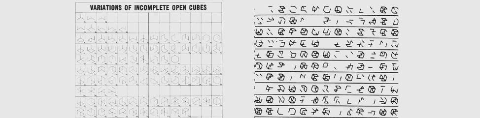
Sol LeWitt’s variations of incomplete cubes and Manfred Mohr’s Scratch Code Portfolio
3. A is A Because it’s Next to B & C
About 18 months ago I came across the computer based work of Manfred Mohr while searching the Internet for geometric-based art (research for a client-based design project). I was drawn to Mohr’s Scratch Code Portfolio (1974-76) and most specifically a computer-generated chart of variations on incomplete cubes. As an early exponent of digital art, Mohr had programmed a computer to take a complete cube and deconstruct it, generating every variation of the structure in its incomplete form. Underneath the picture of his work was a quote from the artist:
Since 1973, in my research, I have been concentrating on fracturing the symmetry of a cube, using the structure of the cube as a ‘system’ and ‘alphabet’. The disturbance or disintegration of symmetry is the basic generator of new constructions and relationships.6
The variations are laid up in a grid, each a cube a version of the other, but sitting separately as new compositions, symbols in and of themselves. When I read Mohrs quote above, his comment about the spreadsheet of variations working as an undefined system spoke to me — It struck me that there was the potential for an actual alphabet here, the basic idea being that each letter is realised by the corresponding letters on each side, a basic signification occurs and incomplete cubes become words. Suddenly, a certain variation sort of looked like an ‘A’ and looked even more like one when I placed it next to two other variations, one that looked like a ‘B’ and the other like a ‘C’. I excitedly went about drafting up the letters - then turned around to show LW who I was sharing an office with at the time and he pointed me straight to SOL — a typeface made up of incomplete cubes produced by designer Radim Pesko in 2003. After my initial disappointment at stumbling upon something completely unoriginal, I began to look into Pesko’s version:
A continuation of Sol LeWitt’s 1974 project entitled “122 Variations of Incomplete Open Cubes”, which consisted of 122 views of unfinished cubes constructed from wooden planks. The new definitions are dependent on the viewer’s imagination and ability to recognize letters in seemingly abstract composition.7
We had both arrived at the same end product, with the exact same theoretical basis, but from two different influences. What heightened the curiousness of the situation for me, was that both Lewitt’s and Mohr’s work from which our projects were based date back to the same year, 1974.

Radim Pesko's SOL and my version, MOHR
4. Ghosts/Dark Matter
With my ‘Mohr’ typeface, some of my favorite cubes are the ones that could be a couple of letters — One that looks like a ‘C’ could just as easily be an ‘E’ dependent on the letters to each side; the word they are part of. It’s as if their ability to signify a certain meaning is made possible by the very fact that they have a lack any meaning in their own right. The meaning is only exists because it is inferred by the surrounding cubes.
In a conversation between musician Brian Eno and writer David Mitchell for The Believer magazine, Mitchell talks about a similar phenomenon in his own work:
Novels are palimpsests written over earlier versions, red herrings, wrongly barked up trees, and still somehow contain ghosts of the novels that didn’t get written in order for this one, the finished one, to emerge(...) all the paths not taken to find the uncluttered path that is taken... I’ve noticed with writing, just by placing sentence ‘A’ — about a ladybird, say — next to sentence ‘B’ — about a mans last three seconds of life — a ‘C’ gets generated as if by alchemy. It’s not there, but it is. You don’t even have to write ‘C’ — in fact, you shouldn’t.8
Mitchell’s thoughts on his own literary practice serve to sum up how this all might relate to graphic design. As a discipline, it always seems to exist in that same kind of inbetween space as Mitchell’s ‘C’; a kind of invisible in-between, a place where any number of other disciplines are referenced and (maybe) bastardized.... Its the thing that gives ‘Love And Theft’ a definite immediacy, because we have heard it before... or at least it sounds like we’ve heard it before. The audience inadvertently brings a certain amount of history to the record. Or how my stumbling upon the Worlds End only happened because of a number of bad decisions on my part, or how ‘Sol’ and ‘Mohr’ both exist as some kind of watered down version of their fine art counterparts. All rely on anchor points to exist and to be traced, while at the same time; becoming anchor points themselves. Evidence of evidence.