Graphic Language: Tony de Lautour
Between the 22nd of November and the 11th December 2012, I conducted an email interview with Christchurch painter Tony de Lautour. Having visited his house often over the past few months while we were working on a publication together, our talks regularly gravitated towards what he was working on, and older work of his that is scattered on the walls throughout his home. This interview attempts to concentrate some of the re-occurring themes of our chats, and also includes a transcription (the section in italics about halfway through) of a conversation at his house, recorded on the 29th of November.
Matthew Galloway: As a starting point, I'm interested in the trajectory of your paintings over the last few years. Symbolism has always been prominent in your work, right? But more specifically looking at words and letterforms, I'm intrigued by their apparent 'take over' and then disappearance into abstraction. Take a painting like Text Message (2008) for example—which is completely dominated by letters/words—and compare it to your most recent paintings. Formally they are very similar, but recently the letters have merged or distorted into abstract forms, they don't 'say' anything like they used to. I was wondering whether that move into abstraction was intentional, or whether one day the letters just stopped being letters?
Tony de Lautour: Yes, symbolism has played a prominent part in my work. Early on it was mostly from amateur or prison tattoos, especially those with some sort of nationalist content, also symbols from Christianity, alchemy, heraldry, etc., and from other artists such as Gordon Walters’ koru that reoccurred as a 'p' or 'b' letterform. The way that these symbols are used in the original source material is usually quite structured or formal and I think this has been an influence on the formal aspect of my paintings.
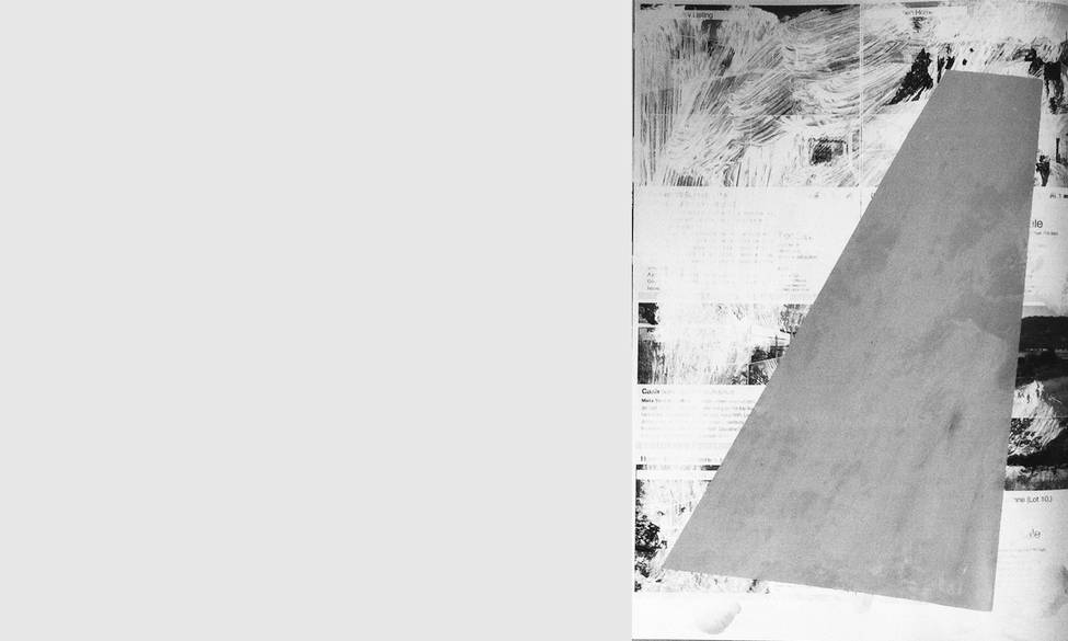
The letterforms started partly as an extension or enlargement of the title of the painting. In earlier paintings such as South Seas (1996) and This Is It, Take It All (1995), the title or text element is prominent and becomes a structural element in the painting. In the later text paintings, where I began to use geometric forms and symbols such as the cross as substitutes for letters, the title or text takes over to become the entire content. It happened in a gradual way that reflected my concerns at the time—Cubism, Constructivism, song lyrics, names, text messages, and a remixing of elements from my earlier paintings. A gradual change in the same way that now the text elements have mostly reverted to abstract forms. I wouldn't say that it was an intentional move for the shapes to stop being letters; it was more that the focus of the work changed towards the structural possibilities of the shapes. That was already beginning to happen pre-earthquakes and seemed to accelerate afterwards, probably in conjunction with the Property Press work, and the general atmosphere that seemed focussed on buildings, city plans and the changing environment. The abstraction was also partly a reinterpretation of Cubism and Constructivism—the building blocks of modernism, which is essentially utopian—and combining them with the new concerns in my recent paintings. I would never say that the text element has entirely disappeared as the letterforms still reappear occasionally in recent paintings such as Load (2012). It would probably be more accurate to say that it has just been slightly subdued at the moment...
MG: I've been reading this text Writing in Residence by Wynstan Curnow, from the 1995 book New Zealand Modernism in Context. He talks of a similar thing to you, that during this period, writing began to creep from the title plaque and the artist’s signature into the paintings. Curnow makes the observation that for Colin McCahon, it was a case of his signature—his hand writing—taking over, where as with Billy Apple, he's taking the typeface off the title plaque and blowing it up. There are two points I want to pick up on from here: one is that you have kind of done both (and again this seems to run parallel to some sort of move towards abstraction). Your earlier works contained a lot of handwritten words, where-as in the later ones you are using big typographic blocks... still in a unique style, but it does feels removed in comparison; the natural hand, the signature, has been replaced. Do you see it that way? The second point I want to make is again picked up on by Curnow. Using McCahon and Apple as examples (adding to your example of Walters) there seems to be a proliferation of word-based paintings in New Zealand's brand of modernist painting. I was interested in this, paired with your comments about the acceleration of abstraction in your paintings since the earthquakes, and I was wondering how important location and context—your surroundings—are to your work? Are you conscious of how location and circumstance are affecting your output? Or is it something that only becomes apparent with hindsight?
TdL: Yeah you're right... In some of my paintings there is a mix of handwritten and hard edge words or letters. Slowly the geometric shapes became more interesting and more dominant until they took over. The handwritten words in the earlier paintings were mostly either an extension of the title, part of a composition anchored around an enlarged title or a more immediate response to the symbols I was using and worked into the composition. Sometimes like trying to record a transitory experience transcribing words that sprung to mind or lyrics from songs I was listening to at the time. A few paintings were comprised solely of song lyrics with a few images… like a sort of pop music McCahon.
As the typographic shapes took over the paintings became much more formal. The word or phrase determined what shapes were used and the method was more ordered. Although the immediacy of the handwritten was removed there were obviously still decisions to be made around colour, size of shapes, etc. within the scope of the word chosen. Also using masking tape to get a harder edge also slowed the process further. With the handwritten words it was like trying to capture an all-over transitory experience whereas the geometric typography—using a modernist style and composition—was giving substance to throwaway words, phrases, text messages, etc.
Also, thinking about the actual signature in the paintings containing handwriting, it was easy to place my handwritten signature within the painting composition. In the geometric works the handwritten signature had to go on the reverse of the painting as it looked entirely out of place and interfered with the composition (unless it was done in the similar geometric style). So in that very literal sense the handwriting was removed from those works.
Working in New Zealand it would be hard not to be influenced in some way by the word paintings of McCahon, his work and the adulation of it cast a long shadow over New Zealand art. You see the text influence in Ralph Hotere, Peter Robinson, Shane Cotton, etc., and even maybe Bill Hammond's use of prominent script titles. Also if you were a New Zealand painter using text the audience here would connect it with McCahon. Maybe a European audience would connect with Dada; Americans with Jasper Johns. The influences on a painting then start to become more to do with local histories. Later on I got to know Billy [Apple] and his work when I starting exhibiting in Auckland and at Hamish McKay Gallery Wellington in the early 1990s. He was very supportive then [when my work was figurative] via his comments, design sense and purchase of my work… I hadn't really thought of it before but maybe the way you describe his titles becoming the subject, it might have influenced my text paintings. It is also somehow apt that in the week prior to the February earthquake Billy was the last person to visit my studio in the Tower Building and talk about the paintings there...
Location and context is important. One of the few things I remember my high school art teacher saying to me was that: ‘you cannot make art outside of your own time and place’. It’s a very obvious statement but no matter whether you are fully conscious of it or not your surroundings or current situation affect you and your artwork. It is not always evident at the time but usually does become more apparent in hindsight. The work becomes a sort of diary of current concerns or interests that manifests itself in the paintings. Just prior to the earthquakes I was going through some sort of mid career re-evaluation by remixing and reusing ideas from my earlier works combined with an interest in Constructivism and Cubism. At the time it was just about finding a way by painting through it. After the earthquakes, once I had set up a studio again, abstract work was like an escape combined with the fact that I started to become uncomfortable with any figurative painting. I felt it was somehow inadequate which contributed to a quicker move toward abstraction. Although initially I thought I wasn’t too influenced by the earthquakes; the sight of demolished buildings, etc. But slowly the forms started to appear less like typography and more like building blocks.
The Property Press works were a different process. Before the earthquakes I would pick up the Property Press on my way to the studio, so they were lying around on the floor and became a convenient surface to work on. At that time they were more of way of working out ideas loosely to do with property, responding to forms or the layout of a particular page. After the earthquakes the implications of working over the Property Press altered and I quickly became aware of it.
However, it only has relevance to someone who knows the context within which the artwork was created. In another place or time they will be out of context and read differently...
*******
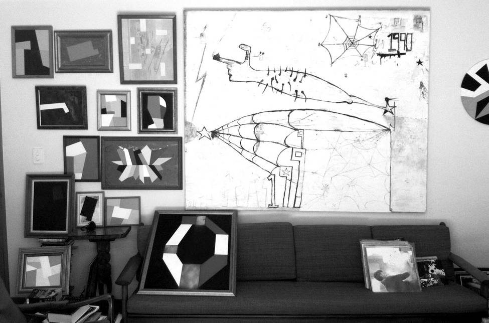
Tony’s lounge room wall, the large South Seas (1996) next to a group of new paintings, including Blocks in the Sky, Wigram top row, third from left.
TdL: (referring to the new painting top of the picture) It's a picture of Wigram Air Field, but obviously from the 1920s or something like that. I thought I might call it Blocks in the Sky, Wigram.
MG: Yeah, that's cool.
TdL: Did you want a cup of tea or something? Coffee?
MG: Yeah, a tea would be good. I quite like the one that’s just black on black.
TD: Oh yeah the Malevich-type one?
MG: Is that a new one as well?
TdL: Yeah, new-ish, within the last month or two months. I think what I'm going to do for this show with Bill [Hammond] and Jason [Greig] at the NG Space [Christchurch Art Gallery's temporary space] is put up a block of those sorts of works, with those sorts of frames around them. I don't know quite how I'll do it, I guess I'll work it out when I get down to the space—that's the only way to do it. I quite like that, when they are all put together like that, they start to make little connections with each other.
MG: The Blocks in the Sky, Wigram one and the other one in the middle are doing the same kind of thing you did with the Property Press works—painting over the top of pre-existing images.
TdL: Yeah, they have to relate to what's underneath them. The one in the middle there was a landscape.
MG: You can still make it out, only just...
TdL: It was one of those works that you sort of blunder your way into, then I found myself saying 'damn I wish I hadn't painted so much grey over it’
(Laughter)
You had milk aye?
MG: Yep. Are the block paintings quicker than the ones you used to do?
TdL: No, actually they're slower! That's the funny thing about them. Well, that blue one, I did the spray paint about 2 weeks ago—I'd just found the frame and picture in a 'free' box at a garage sale... and then it was just yesterday I did the blocks on it. So I guess in terms of time, it didn't take that long, but it happened over the period of a couple of weeks.
MG: Because you have to tread carefully? Be more precise perhaps?
TdL: Yeah, and especially when I'm painting over the top of an image I want to still be seen—any mark I make is erasing the background, unlike when I just have a black background and can just paint over the top of things that aren't working.
That one sitting on the couch there that looks like a circle... I would have done the spray painted bits over a month ago and then over the last couple of days I did the white and red areas. They just seem to come together. Sometimes it’s really slow and nothing happens... then the next step happens real quick.
MG: Then suddenly it's finished.
TdL: Yeah, I guess the bottom line is I don't really have any set formulas. Each painting seems to determine its own outcome in a way. I don't really start with an idea of exactly how it's going to look... and even when I do they usually change on me. It's very rare that I'll do a drawing and then completely replicate it.
MG: So compared to the big one there, was it actually made in ‘99?
TdL: No it was actually made in '96 but at the time I was really interested in dates, and thinking about the Millennium and turn of the decade etc. So I kept putting '1990' and '1999' in works.
MG: With those older paintings, were they more the type that you would sit down with the same one in front of you from start to finish?
TdL: No the process was the same as it is now really—I would have done drawings and works on paper, and then just started... and you'll probably see there are bits that get painted over or painted out. Like in those cobwebs, underneath them is a knife with a bird-head handle. That's just something that was there that I've painted out, but still kind of left in. There's probably some other stuff underneath that I've completely painted out. So they're the same—built up over time then finished. Then with the black ones I used to do, with all the small white images painted over top, they took a lot of time, I'd apply myself with them, and do about a square metre a day... and with them I started incorporating these big shapes with masking tape—circles, big crosses, letterforms, a triangle letterform... then I'd just go from one side to the other just filling it in with stuff... handwriting really, including words that popped into my head, or were on the radio or in the songs I was listening to at the time.
Probably the most prescriptive paintings I've done are those mountain ones where I take a logo, like a NIKE swish... then just filled in with the mountains—copying them out of old books and that sort of thing. Apart from how I chose to build up the mountains, everything about those paintings was fixed in place. And initially they took ages to do, but the more I did, I got pretty quick at them, faster and faster to the point where I was like 'man, this is a formula!’ That's when I became quite bored with it. You probably get the same thing with design—you find something that's a real challenge, you do it a couple of times, then it's easy and you need something else to keep you interested.
MG: Well, thinking about the logo paintings from a design perspective—logos are formulaic in the first place. They're inherently simple; made to be iconic, especially the logos you were working with...
TdL: Yeah—I guess all the initial problems of design; form and proportions and everything are done for you, that almost Pop Art aspect.
MG: You stumbled on something that worked—the size of the mountains inside the logos etc.
TdL: Yeah, and they're little New Zealand mountains, so there's a globalisation aspect there when you start to put them in a Nike logo.
Those particular paintings... they sold really, really well, and I probably could have just kept churning them out for ages... but in the long run it wouldn't have done me any good, because I would have just got sick of them. I could have easily done too many, I probably did do too many... Especially when people start coming to you and asking: 'Hey, can you do this logo? Or that logo?' I did do a couple of those, because it was quite funny to do them...
MG: Wait, people started coming to you with requests for a specific logo?
(Laughter)
TdL: Yeah, it was like I'd made myself into a machine, just pumping these things out at request!
MG: Yeah, you start out making a comment on logos; ideas of corporation, marketing machines, globalisation, etc. And then you end up being pulled in to a client based relationship, a service provider, entering into the marketplace.
TdL: Yeah, the one man factory or something.
MG: It's interesting how if you look at most artists, or designers, or bands... often they they'll have a long and varied career with different bodies of work and stages. But one particular group of work gains a broader appeal, and they become quite known for it, even though work previous and afterwards might well be more interesting. It's weird—and you can't predict what or why a particular group of work seems to resonate in such a way.
TdL: Yeah and people forget about the other stuff... I feel quite fortunate in that respect that there have been a couple of groups of works that people have been responsive to in that manner. Like the revisionist paintings I used to do, but then I just stopped painting them or felt I'd got as far as I could with them at the time. And now that I'm doing this sort of abstract work, people go 'I wish you'd still do paintings like that big oil painting' [referring to South Seas]—but that's almost 20 years ago now... and if I were still just doing them then there would be something wrong with me.
MG: Do you think it's simply that once you stop doing a certain type of painting, people instantly want more of the like?
TdL: Yeah, maybe the same thing will happen if/when I stop doing the abstract stuff.
But I don't really see a huge difference between the likes of that big oil painting and the small ones to be honest. They're both very formal, obviously there's a figurative element that's not there but...
MG: I was actually thinking that just before, and relating it back to the other day when we were talking about McCahon using type but in blocks... in a very ordered fashion. And you can see the same thing in the big painting; you could easily turn the figures into blocks.
TdL: I always saw them that way; as quite formal paintings, I was at least as interested in the formal aspect as in the figurative, the subject of them.
MG: Again, as I think we've touched on in our emails, your early paintings have both of those elements—the figurative and the formal. But then with the abstraction, that duality doesn't exist?
TdL: Yeah... but then I always find figures creeping in to them—like that one below the Wigram painting, to me it's reminiscent of the heads I always used to paint. And the letterforms come back too, but built up out of blocks.
MG: I guess that's the beauty of abstract paintings; there's a clear duality in your early paintings with the figurative and the formal... but then with the abstract—there's the formal and then maybe a number of figurative options available to the viewer.
TdL: Yeah, open to interpretation, in a different way...
*******
MG: The Property Press works... was that the first time you'd painted over pre-existing images? I was thinking since my visit the other day that in some ways it's quite a shift in methodology to suddenly pick the property papers you use as a working surface and begin to use them as the surface for your work. But then I thought, maybe it’s just a natural progression of your practice? You were already taking your surrounds, song lyrics, texts, etc. and using them as formal elements to play with in your work. But then again, surely with the Property Press (and the new paintings like Blocks in the Sky, Wigram), the process must be different? Responding to and interpreting the pre-existing forms with new forms as opposed to working from scratch?
TdL: No, it wasn't the first time I have used pre-existing surfaces or found images or text. About 15 years ago I did a series of paintings over old oil paintings that I bought at garage sales and auctions. They were mostly landscapes into which I added figures, snakes, small grave-like trenches in the outline shape of the map of New Zealand and so on. The additions were usually worked into the painting so that they did not look obviously intrusive, at first glance anyway.
Actually I would (and still do) paint on almost anything that ended up in my studio: magazine pages, envelopes, brochures, softball bats, hockey sticks, saws, bottles...anything that has a surface that could hold paint. More recently for me it has included using old found picture frames and house paint from garage sales as well as the Property Press pages. It’s really just an extension of the idea of the found object. I'm interested in how the found object provides a starting point with its own particular history, associations, and references that become part of the finished work.
I think the Property Press works are just a natural progression and are similar to those earlier works in that I am reacting to an existing starting point. The result can be determined partly by the way the paint physically reacts with the surface and/or the way you deal with the pre-existing imagery. Some worked with the grid-like layout of the real estate magazine page resulting in a formal modernist look. Others had paint blobs or brush stokes that were more of an intervention over top of the grid format. The recent paintings over old prints or found paintings are quite different to what I did ten or so years ago as the geometric forms aren't worked in to the image, but instead tend to intrude onto or cover the original painting.
Using pre-existing surfaces creates a situation with problems that I need to solve. I think it helps keep the work and process fresh by reducing any tendency towards formula, like what we were talking about earlier with the mountain logo paintings. Just through the process of painting I quite naturally shift into another area especially if I think I have exhausted an idea. It is just part of my process to disrupt or change the work in order to progress and generate ideas. Some artists have a fear of shifting away from an idea or style that has been successful but can just end up repeating themselves. On the other hand I do sort of admire artists that can spend years just refining and reworking essentially the same idea and still manage to keep it interesting. Artists always need to find ways to keep themselves engaged with the work, especially if they want their audience to stay interested...
MG: Yeah, the need to move on, but at the same time to keep record... I guess one follows the other. And it’s a nice way to think of your paintings—always evolving and pushing outwards—but at the same time each one being a distinct marker of the time and place in which it was made. To finish, and getting back to where we started, I was interested in your comment earlier about your paintings being kind of like a diary, again especially because of the number of ways that your surroundings find their way into or become your paintings. Do you think that's why letters and words have played such a role in your work? You spoke earlier of painting to work something out or to get from one idea to another; thinking of your work like this, the use of words starts to feel like notations, the paintings like notebooks. Somehow this links to ideas of labour, and the very physical act of painting—the process (both physical and otherwise) is made more apparent through the inclusion of the handwritten word, I guess because of the universality and immediacy of it?
TdL: I suppose the inclusion of handwritten words gives a certain emphasis to the ideas in the painting and physical record like a diary. That happens with both the choice of words and delivery. The handwriting is more immediate like a flow of thought whereas using the geometric typeface gives a transient message a formal stature. Also when the words are from song titles, lyrics, and text messages, they are pre-existing words, which is similar to using the found object. It is the delivery that changes the perception. You clearly see it when someone like Richard Prince paints the text of a joke in quite a deadpan formal typeface, or how McCahon renders a passage from the Bible but invests it with his emphasis through his handwriting. Even these examples are quite revealing by showing the very different attitudes of the two painters. Maybe McCahon should have written out some jokes...
I think you are right about the function of words in the painting. They can operate as a dialogue with the image and direct meaning that could otherwise be more general. Possibly the words are also a labour saving device as they are immediate and the effect would be different to achieve through an image alone. The way you read a particular image is directed by the other images or words surrounding it. A painting like South Seas has a particular time period reference by including the dates 1990 and 1999. That particular painting would be quite different without the dates and words. Words can fix a painting to a particular time or meaning and maybe make it less open to interpretation than an image. Once words are there you’re stuck with them and the direction they guide the painting… but then again I have a tendency to confuse or alter meanings and images if I can.
There is no simple way to explain it because you are simultaneously operating within both areas: the formal and the figurative. But maybe that’s the point of it—just do it without worrying about the explanation. Sometimes images need words and words need images.