Art Over Nature Over Art
This article originally appeared in The Silver Bulletin #7.
Identity, we might already conclude, is not a truth embedded in the history and experience of a community but a construction, its meaning contestable, adaptable, even disposable.
- John Cookson, Pilgrims’ Progress — Image, Identity and Myth in Christchurch
Art Over Nature
The Christchurch City Council (CCC) logo, as stated in the city brand manual, is made up of four descriptive elements: the blue skies represent the clear open air of the Canterbury Plains, the green ground represents the green spaces of the ‘Garden City’, the winding line represents the Avon River, which in turn leads the eye up to the centerpiece—the iconic Christchurch Cathedral. Introduced by the Council in 1988, the logo was far from a rebrand, but more of a graphic formalisation of an identity initiated some 140 years earlier from the very moment the Canterbury Association in London designated the swamplands of Canterbury for their new city; when they ‘envisaged its settlement as a transplanted model English community.’
In 1850, a large portion of the land that now makes up Christchurch was a swamp. Over the first 100 years of Christchurch’s development, this swamp was effectively drained to make way for an ‘English garden’. The European settlers viewed this process as a ‘triumph of art over nature’, systematically changing the environment they had chosen to inhabit in order to make it familiar and marketable. The CCC logo is a direct descendant of this process, but as historian Eric Pawson noted in 2000:
The blandness of the logo thus hides the history of the land. It also hides the hazards of developing a heavily populated ‘garden’ on such a site.
It’s important to understand this history, as it shows just how easy it must have been, come 1990, to create a descriptive logo around such a well cultivated, pre-existing brand. It also brings extra weight to the present day situation of Christchurch; a state of shifting identity that was set in motion when a 6.3 earthquake caused the Christchurch Cathedral to partially collapse in 2011, along with the majority of same-era heritage buildings that defined the ‘England-of-the-south’ Christchurch brand.
Changing Meanings
A descriptive logo refers directly to its object—the company or product in question. A clear and simple signification occurs as the relationship between logo and product is easily determined in the mind of the viewer. In this way, the well-groomed, stylised river, weaving through flat greenery to the man-made center/heart of the city that is the Cathedral, is a highly motivated, highly descriptive signifier of ‘English Christchurch’.
However, from 12.51pm on February 22nd 2011, the Christchurch City Council logo could no longer be classified as descriptive. So what has it become? How can it now be categorised? As metaphoric perhaps? But a metaphor for what? Currently the logo exists as a kind of graphic memorial to pre-earthquake Christchurch. For nearly a year and a half the ruin of the Cathedral has cast a solitary figure over the red-zoned Cathedral Square, but yet it can still be seen standing tall in the many incarnations of the logo. When you go for a walk on the Port Hills you see the logo on walkway signage, when you receive your rates bill in the post the logo sits atop the letterhead, and when you pay for your parking, the ticket has the logo burnt into it—with the phrase ‘Your Council, Your People, Your City’ underneath.
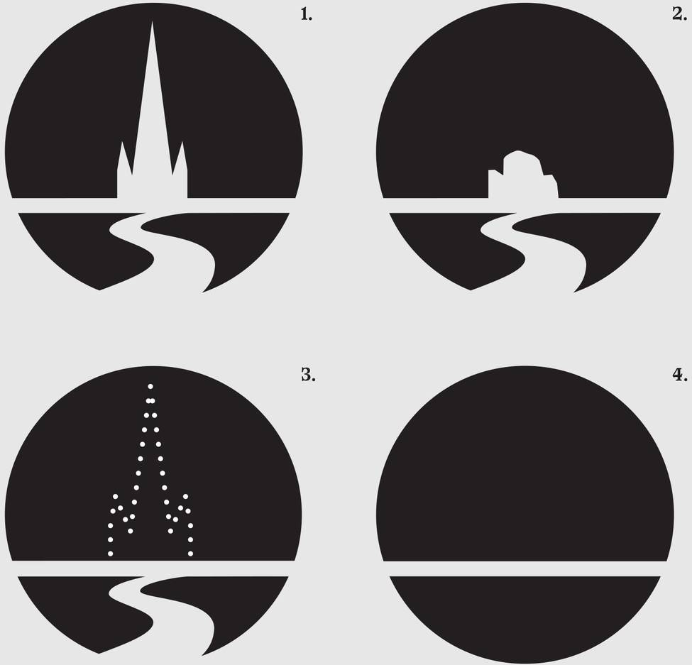
Elements of the current CCC logo (2007– )

1. The blue represents the open skies of Canterbury.
2. The green represents the green space of the garden city.
3. The Christchurch Cathedral in Cathedral Square.
4. The River Avon.
Logo as facade
What is perhaps most striking about these circumstances is that it brings to light just how vulnerable a logo, or visual identity, is. A logo exists as a veneer, a facade that by itself means very little. The moment the product that is being represented changes or ceases to exist, the logo loses its worth and its functionality, or the logo’s meaning is changed entirely.
Paradoxically the Christchurch example also underlines the potential power of a logo. To represent something well is to connect the viewer with the subject, to intercede, and in the case of a city, to represent something that is essentially too big for the eye to take in all at once. The logo serves to represent intangibles. No one can ever ‘see’ a corporation like the CCC, it is, in a sense, invisible; a group of people and products brought together in a certain location and defined by a set of driving values and ideals. It needs a logo to stand in its place, and to represent it/speak for it. The logo, though a shallow, two-dimensional form, has the ability to represent something bigger than itself, both tangible and intangible. And in the case of the CCC logo, logo-as-facade is a doubly appropriate way to think about it; the stylised Cathedral is represented as such—a flat, two-dimensional representation of the building... it could literally be a facade.
Building as logo
A facade augments the underlying nature of the content it represents. It is a front. In architecture, the facade works to give shape and meaning to what is often a bland shed of a building sitting directly behind it. In a similar way to a corporation, the building—in its box-like ubiquitousness—is in a sense intangible. Though the content sits inside it, the building needs the facade to intercede with the passer-by, to broadcast what they will find upon entering the shed.
This common function of the facade and the logo holds the potential to create what architect Jeffrey Inaba calls ‘broadcasting architecture’, a term that is expanded upon by design researchers Metahaven:
In the process of (...) ‘broadcasting architecture’, iconic buildings multiply as they turn into globally exchanged images. A physical building, its photographic image, and its geometric shape are to some extent interchangeable. The extent to which they are interchangeable determines the potential for broadcasting.
As the facade is essentially a two-dimensional shape, it has the ability to not only act like a logo, but to BE a logo—the same shape, but represented as ink on a page. As an example of this, the Christchurch Cathedral is broadcast as the CCC logo and in turn the logo points us back to the building, reinforcing its status as an icon and symbol of the city and emphasising its importance as an exportable symbol and marker of identity.
Nature Over Art
In the case of Christchurch however, the degree of interchangeableness that exists between the logo and the building is suspect—the logo, stylised as it is, actually looks nothing like the Cathedral itself. The Cathedral is asymmetrical—a steeple with a fat, lower triangle off to the side, while the logo is symmetrical—a proportionately much higher steeple with smaller steeples on each side. So, in this instance, building and logo were only ever interchangeable to a degree—a degree made even greater with each stone taken down from building. Presently, the question of whether the Cathedral is to be demolished or restored remains unresolved, but regardless of whether it is rebuilt or taken down, the gap between how the city is represented through its visual identity and the reality of its current state points toward something of an identity crisis. It could be argued that we are back where we started... a swamp... this time of bricks and mortar. As warned by Pawson, the swamp has come back to bite us, the city was built on sandy ground—apparently highly moveable in an earthquake. The danger now is—as was the case when an English garden was imposed on the land some 150 years ago—that a swamp needs defining, it needs to be cultivated and tamed. The city has already seen the consequences of constructing an identity that is all facade, so what next for Christchurch? As quoted at the beginning of this text: if an identity is a construction, then it is contestable, adaptable and even disposable.
Suggested responses: